Range Rover has done it again. Just when you thought Jaguar Land Rover (JLR) had learned from last year’s Jaguar rebrand disaster, they’ve introduced a new Range Rover logo that’s got people talking – and not in a good way.
What’s Changed This Time?
The luxury SUV brand has revealed its first-ever standalone emblem in 55 years – a design featuring two mirrored letter R’s stacked on top of each other. The logo was initially spotted in a JLR investor presentation and later showcased at Milan Design Week, complete with a gold finish that some say gives it a slightly more premium feel.
But here’s the thing that’s got everyone scratching their heads: this new motif won’t actually replace the classic “Range Rover” script that’s been on every vehicle since 1970. Instead, JLR says it’s designed for smaller applications – think merchandise labels, event spaces, and repeating patterns where the full wordmark just won’t fit.
The Public Reaction Has Been Brutal
Social media has been absolutely ruthless about this new design. People are comparing it to everything from belt buckles to expensive aftershave bottles promoted by David Beckham. One user on Twitter summed up the general sentiment perfectly: “Someone said the new range rover logo looks like a belt buckle and i cant unsee it.”
The criticism doesn’t stop there. Critics say it looks more fitting for “an unimpressive concept EV than a storied luxury vehicle” because it has no historical value or link to the brand’s established heritage. Others have described it as looking like something that belongs on “a dance artist from the early noughties debut album cover” rather than a premium automotive brand.
Why This Feels Like Déjà Vu
This controversy comes hot on the heels of Jaguar’s disastrous rebrand in late 2024. That “Copy Nothing” campaign was so poorly received that Jaguar’s European sales plummeted to just 49 cars registered in April 2025 – a 97.5% drop from the previous year. Even Tesla CEO Elon Musk mocked the Jaguar rebrand, asking “Do you sell cars?” when the brand’s colorful, abstract campaign launched without showing any actual vehicles.
The Strategy Behind the Madness
To understand why JLR keeps making these bold branding moves, you need to know about their “House of Brands” strategy. This approach splits Range Rover, Jaguar, Discovery, and Defender into separate sub-brands, each with their own distinct branding and marketing strategies.
As Range Rover’s chief creative officer Gerry McGovern explained in 2023: “In luxury, you need clarity, absolute clarity, and Land Rover Range Rover SV Autobiography doesn’t give it.” The goal is to eliminate the confusing “Land Rover Range Rover” naming convention that’s existed for decades.
| Brand Element | Details |
|---|---|
| New Logo Design | Two mirrored and stacked letter R’s forming a rectangular-blobby shape |
| Intended Use | Merchandise, labels, event spaces, repeating patterns |
| Vehicle Badging | Traditional “Range Rover” script remains unchanged |
| Part of Strategy | JLR’s “House of Brands” approach separating sub-brands |
| Color Variations | Gold (premium appearance) and black (flat, less appealing) |
| Public Reception | Largely negative, compared to belt buckles and jewelry |
What This Means for Range Rover Buyers
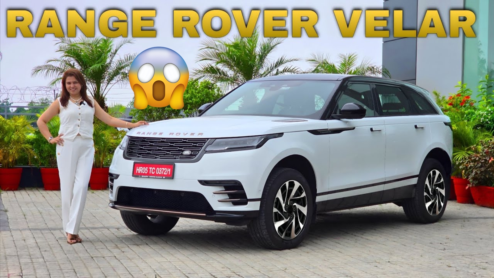
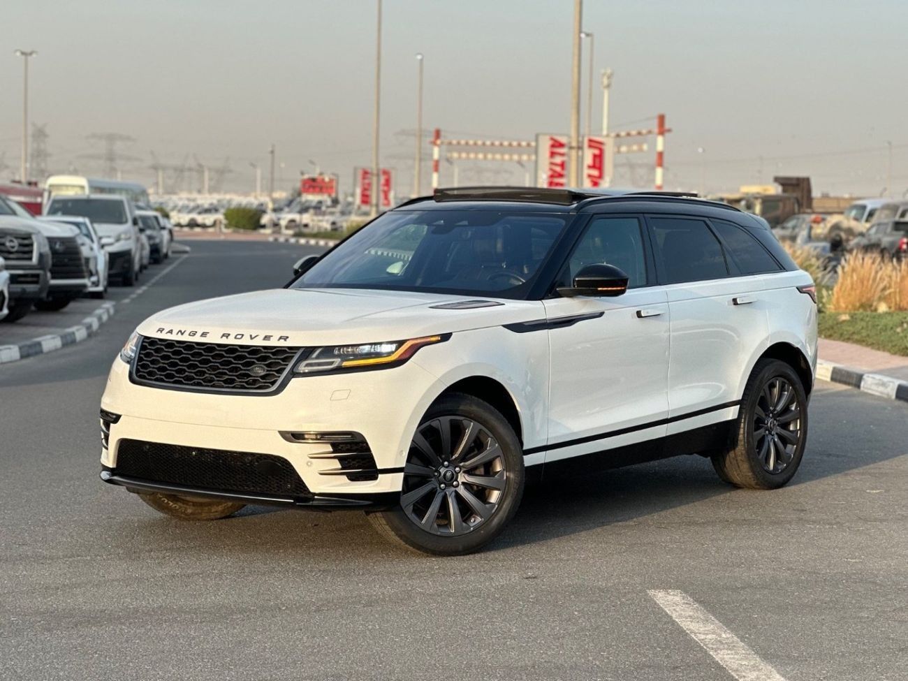
The good news for existing Range Rover enthusiasts is that this new logo won’t suddenly appear on your vehicle’s hood or grille. The classic “Range Rover” script badging will remain on the front and rear of every model, just as it has been since the brand’s launch.
However, expect to see this double-R motif creeping into other areas. It’s likely to show up in interiors, accessories, and marketing materials as Range Rover transitions into the electric era. The brand is also introducing a new repeating pattern made from these R shapes, which could appear on grilles or interior surfaces.
The Bigger Picture
This logo represents more than just a design change – it signals Range Rover’s move toward complete brand independence from Land Rover. While the Land Rover oval badge and name will continue as a “trust mark” on vehicles, Range Rover is clearly trying to establish its own distinct identity.
The timing is significant too, with Range Rover’s first fully electric model expected to debut soon. This new motif will likely play a role in how the brand presents itself in the EV market.
Will This Controversy Blow Over?
As some industry observers point out, logos do evolve, and initial negative reactions often fade. People mocked BMW’s flattened badge and Kia’s rebrand, but the world moved on. The real test will be how Range Rover uses this new symbol and whether it successfully reinforces the brand’s luxury positioning.
For now, though, it seems JLR has once again managed to create a branding controversy that’s got everyone talking – whether that’s good or bad for business remains to be seen.
Frequently Asked Questions
Q: Will the new logo replace the Range Rover name on vehicles?
A: No, the traditional “Range Rover” script will remain on all vehicles. The new logo is only for merchandise and smaller applications.
Q: Why did Range Rover create a new logo?
A: It’s part of JLR’s strategy to make Range Rover a standalone brand, separate from Land Rover’s umbrella.
Q: When will we see this logo in use?
A: It’s already being used in investor presentations and events, with wider rollout expected as new electric models launch.
Widebody Hyundai i30 N Wagon Rendered With Aggressive New Look